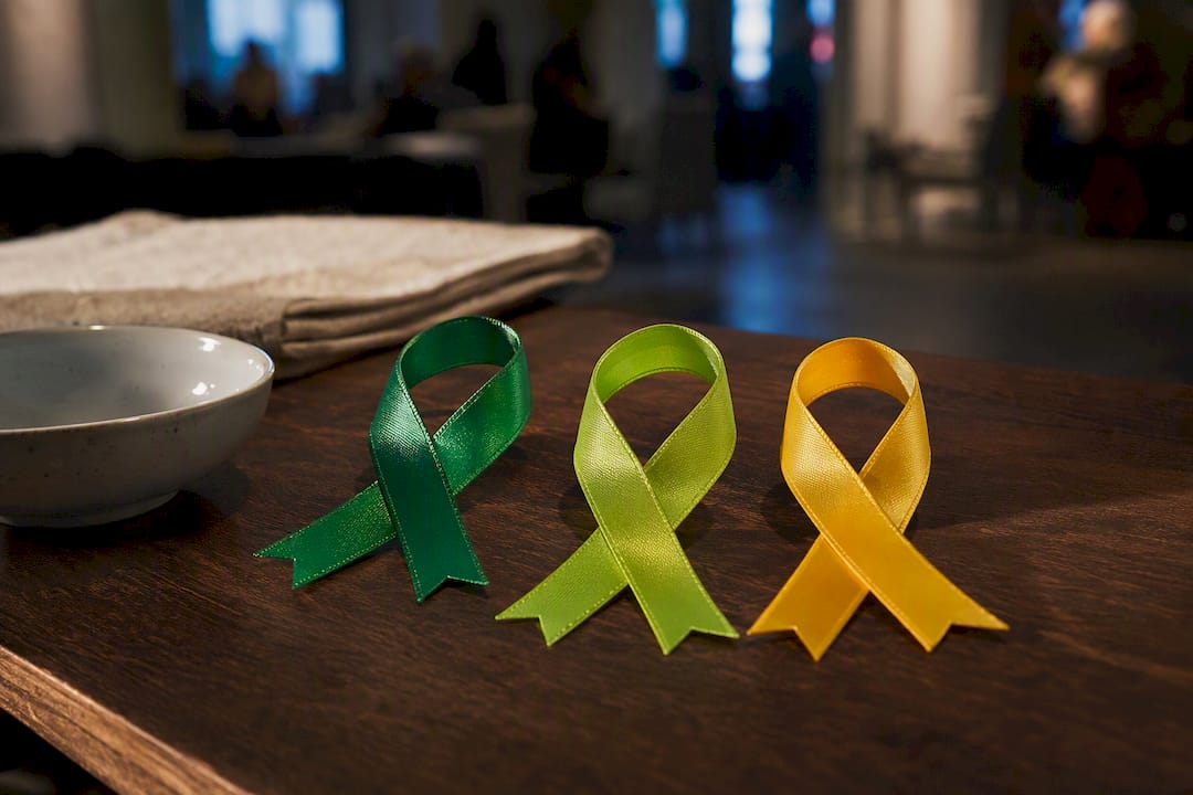
Green is the standard ribbon color for mental health awareness, and lime green marks children’s and youth mental health specifically. Beyond that, the rule is simple: teal, purple, yellow, and orange each point to a specific condition, from anxiety to suicide prevention to self-harm. Wear green when you want to show general support. Pick a condition-specific color only when that is your intent, and add a short label if the setting could confuse people.
TL;DR:
- Green is the most widely recognized color for general mental health awareness and is used in May during Mental Health Awareness Month and throughout the year for broad support.
- Lime green specifically represents children’s and youth mental health campaigns, helping distinguish them from adult-focused messaging.
- Teal typically indicates anxiety or PTSD awareness but is not standardized, with some campaigns opting for green to emphasize general mental health rather than a diagnosis.
- Yellow is the designated color for suicide prevention, especially in campaigns encouraging help-seeking behavior before crises occur.
- Because ribbon colors grew from grassroots efforts, their meaning can vary based on context, event timing, and organizer, making clarification and direct questioning essential.
Table of Contents
- Mental Health Ribbon Colors at a Glance
- Which Ribbon Color Matches Which Condition?
- When Timing Tells You the Color
- Wearing and Sharing Ribbons the Right Way
- Where to Verify Official Colors
- Why the Same Color Means Different Things Depending on Context
- A Publisher’s Note on Why the Colors Matter
- Finding Ribbons and Apparel That Support the Cause
- Sources
- FAQ
Mental Health Ribbon Colors at a Glance
If you only remember one color, make it green. It’s widely recognized as the international symbol for general mental health awareness, the one you’ll see at community walks, workplace wellness weeks, and every mainstream May campaign. Everything else on this list narrows the focus to a specific condition or age group.
- Green — the default for general mental health awareness, recovery, and anti-stigma messaging. It’s the color you reach for when the goal is broad support rather than one specific diagnosis.
- Lime green — children’s and youth mental health. Pediatric-focused nonprofits adopted this brighter, yellow-leaning shade so campaigns aimed at kids and teens wouldn’t blend into general adult mental health messaging.
- Teal — frequently tied to anxiety and PTSD. Several trauma- and anxiety-focused organizations use teal in their materials, though it isn’t governed by one single authority the way some medical symbols are.
- Purple or periwinkle — eating-disorder awareness, with periwinkle specifically favored by groups working in that space. Purple also shows up in suicide-prevention contexts, which is one of the more common sources of confusion on this list.
- Yellow — suicide prevention, especially in campaigns built around encouraging people to ask for help before a crisis.
- Orange — self-harm awareness in many campaigns, and also widely used for ADHD awareness. The overlap means orange alone rarely tells you which cause an event is centered on.
- Silver or gray — mood disorders and some brain-disorder awareness efforts, though usage here is far less standardized than green or teal.
- Blue variants — child-abuse prevention primarily, with some crossover into chronic-illness campaigns. Context matters more with blue than almost any other color on this list.
None of this is regulated the way a nutrition label or a road sign is. Ribbon colors spread through grassroots adoption, one nonprofit at a time, which is exactly why the same shade can mean different things depending on who’s wearing it and why. Advocacy groups gravitated toward green in particular because it symbolizes growth, renewal, and calm, qualities that fit the recovery message mental health campaigns wanted to send.
Pro Tip: Keep a mental note of just three colors if you want the fastest shortcut: green for general awareness, lime green for kids and teens, and yellow for suicide prevention specifically. Those three cover the majority of everyday situations you’ll run into.
Which Ribbon Color Matches Which Condition?
General awareness is easy. Condition-specific support gets trickier, because plenty of diagnoses share colors, and a few don’t have one settled shade at all. Here’s how the mapping tends to break down in practice.
- Depression — usually falls under green or a darker green variant, sometimes teal depending on the campaign. There’s no single depression-only ribbon the way there is for some physical illnesses, so most campaigns fold it into general mental health messaging.
- Anxiety — teal shows up often, particularly from trauma- and anxiety-focused groups, but plenty of anxiety-specific events default to green when they want to signal “mental health” broadly rather than the anxiety diagnosis alone.
- PTSD and trauma — teal or a lighter teal variant appears across many campaigns, with some veteran-focused organizations using their own distinct shade. If you’re supporting a veteran-specific PTSD event, check that group’s materials rather than assuming teal automatically applies.
- Eating disorders — periwinkle or lavender is the most consistent choice, promoted specifically by groups like NEDA. Purple appears occasionally too, which is worth double-checking against the specific organization’s branding.
- Suicide prevention and survivor support — yellow is the color for prevention-focused campaigns. Loss survivors and memorial contexts sometimes use different combinations, including teal and purple together, or black and purple, depending on the organization running the event.
- Self-harm and ADHD — orange covers both in many awareness activities, which means an orange ribbon at a general event doesn’t tell you which cause it’s supporting without more context.
- Bipolar disorder, schizophrenia, and OCD — none of these have one nationally settled ribbon color. Most campaigns supporting these conditions either use standard green or adopt a color specific to the local organization running the event.
When a condition doesn’t have a clear standard, the safest move is defaulting to green and asking the event organizer or partner nonprofit what color they’re actually using. That single question resolves more confusion than any color chart ever will, because local campaigns frequently make their own choices based on what their community responds to.
Part of why this stays messy is structural. Mental health advocacy grew out of dozens of independent grassroots efforts rather than one coordinated body assigning colors, unlike, say, the medical field’s standardized symbols. Groups working specifically with children and teens leaned into a distinct visual identity for good reason: dedicated youth-focused messaging improves how well young people recognize and engage with mental health resources, which is exactly why lime green earned its own lane instead of folding into general green.
When Timing Tells You the Color
Context solves half your color confusion before you even open a search engine. Awareness ribbons cluster around specific months, and knowing the calendar narrows down what a color probably means at any given event.
- May, Mental Health Awareness Month — documented and promoted by SAMHSA, this is peak season for standard green. Early May also brings National Children’s Mental Health Awareness Week, where lime green takes over youth-focused events.
- September, Suicide Prevention Month — yellow dominates prevention messaging, while purple and other combinations appear around loss and survivor memorials. The World Health Organization runs World Suicide Prevention Day within this window every year.
- February, Eating Disorders Awareness Week — periwinkle and lavender visibility spikes, particularly around campus and clinical events.
Beyond the calendar, watch who’s hosting. A hospital’s trauma unit running a June event probably means teal for PTSD, not general mental health green. If you’re the one organizing, label your ribbon colors on flyers or signage. One printed sentence explaining what each color means prevents almost every awkward “wait, what does this ribbon mean?” conversation before it starts.
Wearing and Sharing Ribbons the Right Way
A ribbon works because someone notices it and asks a question. That only helps if you can actually answer clearly, and if the color you chose matches what you meant to say.
- Check the event or organizer’s own guidance before picking a color, especially for condition-specific gatherings.
- Pair the ribbon with a short sign, flyer, or even a spoken explanation so people don’t have to guess.
- If you’re selling ribbons or apparel, say plainly where the proceeds go, and coordinate directly with the nonprofit you’re supporting when possible.
- Be careful about adopting colors tied to survivor communities, especially around suicide loss and eating disorders, without checking in with the groups closest to that experience.
Pro Tip: When you genuinely don’t know which color fits, wear green. It’s the one shade almost everyone reads correctly, and you can always follow up with a conversation, a business card, or a link to a resource page if someone wants specifics. Labeling ribbons or pairing them with a short sign reduces misinterpretation far more reliably than hoping people already know the code.
Where to Verify Official Colors
A handful of organizations run the campaigns that actually set these colors, and checking their materials directly beats guessing from a blog post or a social media graphic.
- Mental Health America and NAMI publish general mental health awareness materials and campaign timing.
- AFSP (American Foundation for Suicide Prevention) governs much of the yellow suicide-prevention messaging in the U.S.
- NEDA sets the standard for periwinkle in eating-disorder campaigns.
- WHO, SAMHSA, and the CDC provide broader public health context, official campaign dates, and guidance you can cite with confidence.
When in doubt, verify with whichever organization is actually hosting the event you’re attending.
Why the Same Color Means Different Things Depending on Context
Green isn’t exclusive to mental health. It’s also used for kidney disease awareness, organ donation, and several other causes entirely unrelated to mental illness. Purple gets claimed by eating disorders, suicide prevention, and a handful of unrelated conditions too. This isn’t a flaw in the system so much as a natural result of dozens of independent nonprofits picking colors without a shared rulebook.
The fix isn’t memorizing every possible overlap. It’s reading context the way you’d read any other social signal. Ask who’s hosting the event. Check what month it is. Look at the accompanying messaging on signage, flyers, or social posts. A green ribbon at a May wellness fair means something different from a green ribbon at a kidney disease fundraiser in March, even though the color is identical. When a color is shared across causes, the organizer’s own labeling becomes the decisive clue, which is exactly why well-run events post a small sign or handout explaining their specific choice.

If you ever land at an event and the color genuinely doesn’t tell you enough, there’s no shame in just asking. “What does this ribbon represent today?” is a completely normal question, and it usually opens the door to exactly the kind of conversation these ribbons were designed to start in the first place.
A Publisher’s Note on Why the Colors Matter
I’ve spent years watching a small piece of fabric or a bold graphic on a t-shirt do something a pamphlet never could: make a stranger ask a question. That’s the whole point of a ribbon. It’s not the answer, it’s the invitation. At Schizophrenic, our work grew out of the same idea, that wearable art and honest color choices can open conversations stigma usually keeps shut. A labeled ribbon and a graphic tee aren’t so different. Both give someone a reason to lean in instead of look away.
— Michelle
Finding Ribbons and Apparel That Support the Cause
Plenty of nonprofits sell official ribbons directly, and if your priority is funding a specific cause, buying straight from that organization is usually the most direct route. But ribbons aren’t the only wearable option, and for everyday visibility between campaign months, apparel keeps the conversation going longer than a pin or a ribbon can. Schizophrenic makes graphic mental health t-shirts and tank tops built specifically to spark that same “what does this mean?” moment, minus the risk of anyone misreading a color. Whichever route you choose, look for transparency about where your money goes, and check that the seller’s messaging actually aligns with the cause before you buy. If wearable advocacy is new to you, our guide on what to wear to support mental health is a good next stop, and our full mental health clothing line is there whenever you’re ready to make the statement yourself.
Sources
- The Green Ribbon for Mental Health: What It Means, Where It Came From, and How to Actually Use One | ILTY
- Mental Health Awareness Month | SAMHSA
- World Suicide Prevention Day | WHO
- Adolescent mental health | NCBI Bookshelf
FAQ
What color is the BPD ribbon?
Borderline personality disorder awareness commonly uses a yellow and black ribbon combination in many advocacy circles, though it isn’t governed by one single national standard the way suicide-prevention yellow is.
Is there an official mental health color?
Green functions as the closest thing to a universal standard, widely recognized for general mental health awareness, though no single global authority legally owns the color the way trademarks work for brands.
What color is associated with Mental Health Month in 2026?
Green remains the color tied to Mental Health Awareness Month every May, a timeframe SAMHSA has documented and promoted for years running.
What color is the anxiety awareness ribbon?
Teal is the color most often used for anxiety awareness, particularly by trauma- and anxiety-focused organizations, though some campaigns use standard green when addressing anxiety within a broader mental health message.
Recommended
- What Should I Wear To Support Mental Health?
- Ways to Accessorize for Mental Health Events in 2026
- Campaign Ready Mental Health Slogans: Merch Tested and SAMHSA Aligned
- Mental Health Walk Outfits: 10 Comfortable Advocacy Looks