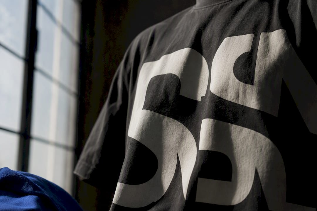
Bold graphic tees work as a visible channel of self-expression and social signaling, not just decoration on cotton. The meaning splits across a few main axes: personal identity, group affiliation, protest or advocacy, and nostalgia or humor. Which one lands depends on the design’s scale, placement, and the context you wear it into.
TL;DR:
- Bold graphic tees rely on scale, placement, and print technique to ensure the message is instantly readable and visually confident.
- The type of graphic, from slogans to illustrations, signals specific identity, group affiliation, or social activism, with each choice serving different communication goals.
- Wearing a provocative or political slogan depends heavily on context, with risks in formal or professional settings and benefits at rallies or advocacy events.
- Design quality, including contrast, fabric weight, and print method, is more crucial than concept in making a graphic tee authentic and impactful.
- Prioritize plain language and community collaboration to craft advocacy shirts that foster understanding and avoid cultural appropriation or legal issues.
Table of Contents
- How Bold Graphic Tees Communicate Meaning
- Types Of Bold Graphics And What They Usually Signal
- What Makes A Bold Graphic Actually Land
- When Bold Graphics Help And When They Backfire
- How To Style A Bold Graphic Tee Without Overdoing It
- Wearable Activism: How Schizophrenic.NYC Uses Bold Graphics For Advocacy
- What Actually Makes A Tee “Graphic” Versus Plain
- Why Graphic Tees Are Back In Style Right Now
- What The Research Actually Supports, And What Most Style Guides Get Wrong
- Sources
How Bold Graphic Tees Communicate Meaning
A graphic tee talks to the world through three things at once: the image, the words, and where they sit on the body. That combination creates an impression before anyone reads a single letter. A chest-centered slogan in block type reads as confrontational or funny within a second. The same words in small script near a hem read as private, almost secretive.
Researchers who study slogan apparel through a pragmatics lens describe this as identity negotiation. Youth and adults alike use T-shirt inscriptions to construct self and group identities, positioning themselves relative to a cause, a scene, or a joke they want credit for understanding. The grammar of the slogan matters too. A command (“Ask Me About My Diagnosis”) pushes harder than a flat statement (“I Have Schizophrenia”), even when the words overlap.
Communication researchers break the function of graphic tees into a handful of overlapping roles:
- Self-expression — broadcasting a belief, mood, or personality trait without saying a word out loud
- Solidarity and affiliation — signaling membership in a fandom, subculture, or movement
- Advertising and promotion — turning the wearer into a walking billboard, intentionally or not
- Protest — using the body as a platform for a political or social message
- Nostalgia — referencing a band, era, or memory that anchors the wearer to a shared past
Academic work on T-shirt patterns as communication treats these as distinct design goals, which explains why two shirts can look equally bold but land completely differently. One is built to persuade. The other is built to belong.
Types Of Bold Graphics And What They Usually Signal
The category of graphic usually tells you more than the specific words on it. Here’s how the major types tend to read on the street.
- Slogans and typography. Direct statements carry the most force. They skew political, comedic, or blunt, and they leave little room for misreading, which is exactly the point.
- Band, fandom, and logo tees. These signal nostalgia and taste. Wearing a faded concert shirt says you were there, or you wish you had been, and either way you belong to something.
- Illustrative art. Original artwork or subculture-specific illustration marks aesthetic identity over message. It says “look at this” more than “listen to this.”
- Photographic and vintage prints. Tribute pieces and archival reproductions function almost like collectibles. The value is partly sentimental, partly about scarcity.
- Abstract and pattern-forward graphics. These skip narrative entirely and lean on fashion credibility instead, which is why they show up more on runways than picket lines.
Gen Z has pushed a sixth pattern into the mix: hyper-specific, almost inside-joke slogans that function as in-group signaling. The Guardian’s reporting on Gen Z sloganwear notes that a slogan too obscure for outsiders to parse is often the point. It filters the crowd for people who already get it.
What Makes A Bold Graphic Actually Land
A bold design either reads instantly or it disappears into noise, and the difference usually comes down to four production details rather than the concept itself.
- Scale and placement. Chest-centered graphics with generous negative space read as confident. Cramped artwork crowded to the edges of the shirt reads as cheap, regardless of the message.
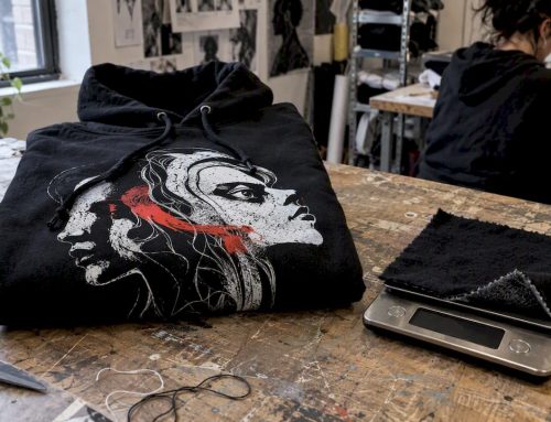
- Print technique. Screen printing holds ink density and sharp edges better than most digital methods. Discharge printing sinks into the fabric for a worn-in look. DTG (direct-to-garment) offers detail but can feel thin if the base shirt is low quality.
- Color contrast. High contrast, think black text on white or a single saturated color against neutral, gets read across a room in under a second, a key concept in the psychology of colors in marketing. Low contrast, tonal designs reward a closer look and suit people who want subtlety over volume.
- Fabric weight and wash. A heavier cotton with pre-shrunk wash holds a print’s crispness longer. Thin, high-shrink fabric can crack the design after a handful of washes, which undercuts even the sharpest artwork.
WWD’s coverage of the graphic tee’s comeback in high fashion points to exactly this: fit, wash, print technique, and artwork scale are what separate a shirt that reads as authentic from one that reads as generic merchandise. The concept matters less than the execution.
Pro Tip: If you want a slogan to read from across a room, keep the type at least a third of the shirt’s width and stick to two colors max. Anything busier starts competing with itself before anyone gets close enough to read it.
When Bold Graphics Help And When They Backfire
Context decides whether a bold tee reads as confident or careless, and the same shirt can do both depending on where you wear it.
A protest slogan works exactly as intended at a march and works against you in a job interview. Family gatherings sit somewhere in between, depending on who’s at the table and how political the message runs. Consumer research on slogan apparel backs this up directly: wearers consistently recognize slogan tees as self-expression but hesitate to wear the boldest ones depending on the room they’re walking into.
A few situations deserve extra caution before you commit to a shirt:
- Confrontational or explicitly political slogans carry more social risk than humor or nostalgia pieces, especially at work.
- Ambiguous wording invites the wrong interpretation, sometimes the opposite of what you meant.
- Imagery borrowed from a culture you don’t belong to, without credit or context, reads as appropriation rather than tribute.
- Unlicensed logos or copyrighted art can create real legal exposure, not just an awkward conversation.
Reading the room isn’t about muting yourself. It’s about matching the volume of the message to the volume the setting can actually hold.
How To Style A Bold Graphic Tee Without Overdoing It
The tee should be the sentence. Everything else on your body is punctuation.
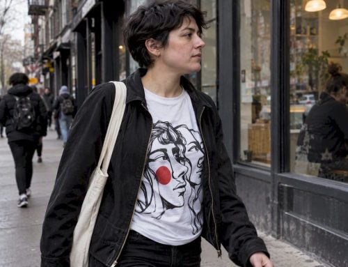
- Anchor and accent. Keep everything else neutral, jeans, plain jacket, simple sneakers, so the graphic stays the one thing anyone’s eye lands on.
- Match the intensity to the setting. Streetwear can layer a bold tee under an open flannel or oversized jacket. Elevated casual pairs it with tailored trousers to soften the edge. Dressed-up looks work best with a subtler graphic under a blazer, where the print peeks out rather than shouts.
- Rotate deliberately. Save your most confrontational or personal shirts for settings where the message actually fits, a rally, a close friend’s gathering, an advocacy event, instead of wearing them on autopilot every day.
That last point matters more than most style guides admit. A shirt that means something loses impact fast if you wear it to the grocery store on a random Tuesday with no context behind it.
Wearable Activism: How Schizophrenic.NYC Uses Bold Graphics For Advocacy
A brand dedicated to mental health advocacy shows how a shirt can start a conversation a pamphlet never will. Such brands put bold, direct messaging about mental illness on T-shirts, tank tops, and accessories, treating purchases as small acts of destigmatization rather than just transactions.
The product lines lean into specificity rather than vague awareness slogans. Its mental health tank top ideas and broader mental health t-shirt collection name conditions and experiences directly instead of hiding behind ribbon-colored euphemism. That directness is the whole strategy: a shirt that says the actual word “schizophrenia” forces a reaction, and that reaction is where stigma starts to crack.
A few principles guide how advocacy graphics should work, whether you’re shopping them or designing your own:
- Co-create messages with the community they represent, not just for them.
- Avoid imagery that exploits suffering for shock value rather than understanding.
- Prioritize plain language over clinical jargon or vague euphemism.
- Let the wearer decide how loud they want to be that day, since not every advocacy shirt has to shout.
Anyone unsure how to wear a message like this in public can check the brand’s own guidance on what to wear to support mental health before picking a design.
What Actually Makes A Tee “Graphic” Versus Plain
A plain tee is a blank surface. A graphic tee is a canvas with something printed on it: a logo, slogan, illustration, photo, or abstract pattern applied to any part of the garment. That’s the entire technical distinction, per the basic definition of a T-shirt as a garment category.
The meaningful difference isn’t fabric or cut. It’s function. A plain tee is neutral by design, meant to disappear under a jacket or serve as a base layer that says nothing on purpose. A graphic tee is built to be noticed. It asks to be read, even if what it’s saying is just “I like this band” or “I was at this event.”
That single design choice, adding a graphic, turns a garment into a message. The shirt stops being clothing you put on and becomes something closer to a small, wearable statement. Whether that statement is loud or quiet, political or funny, personal or performative, comes down to everything covered above: the type of graphic, the print quality, and the room you walk into wearing it. A plain white tee makes no claims. A graphic tee always makes one, even a small one.
Why Graphic Tees Are Back In Style Right Now
Graphic tees never fully left, but they spent a stretch as an afterthought, band merch and novelty prints relegated to the bargain bin while minimalism dominated. That’s reversed. WWD’s coverage of the trend documents a real comeback in high fashion, with designers and celebrities treating the graphic tee as an intentional, styled piece rather than a throwaway basic.
Part of the pull is historical. Graphic tees have always carried roles beyond fashion, advertising, political protest, event souvenirs, and mass screen-printing adoption by the mid-20th century made that kind of mass communication cheap and fast. The current wave taps that same instinct at a moment when people are tired of quiet-luxury sameness and want clothing that says something specific about who they are.
The other part is generational. Younger wearers, particularly Gen Z, have turned slogan shirts into a low-stakes way to broadcast identity without committing to a permanent statement like a tattoo. A shirt can be retired. A message can evolve season to season. That flexibility, paired with a cultural mood that rewards individuality over blending in, explains why the graphic tee’s return feels less like nostalgia and more like a genuine shift in how people want to dress.

What The Research Actually Supports, And What Most Style Guides Get Wrong
Most advice on graphic tees treats the message as the whole story. It isn’t. The academic work on slogan apparel makes clear that grammar, print quality, and context carry as much weight as the words themselves. A shirt that says something important but prints it in a discharge process that fades within three washes has already lost half its power before anyone reads it twice.

The bigger gap is comfort. Consumer research keeps finding that people recognize the value of self-expression through clothing but hesitate to wear the boldest pieces in the wrong room. That hesitation isn’t a flaw to fix. It’s a sign the wearer understands the stakes better than the marketing copy does.
What matters most, if you’re buying or designing a bold tee, is matching intensity to purpose. Advocacy work in particular deserves plain language over vague symbolism, and a design built with the community it represents rather than for an aesthetic trend. Buy fewer shirts that mean something specific to you over a drawer full of shirts that mean nothing to anyone.
— Michelle
If you want a bold graphic that says something real instead of just something loud, Schizophrenic’s mental health awareness tank tops put direct, plain-language advocacy on wearable art built around actual lived experience with schizophrenia. Every purchase supports a mission built on open dialogue rather than vague ribbon-colored gestures, and every design comes from someone who has lived the message she’s printing.
Sources
- T-shirt — Simple English Wikipedia
- How the Graphic T-Shirt Made a High Fashion Comeback — WWD
- Discourse-pragmatics research on T-shirt inscriptions — JBE platform
- Behold: A graphic tee revival! — Journal / compilation referencing consumer research
Recommended
- NEW Schizophrenic.NYC Tri-Blend TEES!
- Schizophrenic.NYC Tri-Blend Women’s Tees!
- Pink Rorschach Test T-Shirt!
- Mental Health Tank Top Ideas for Advocates and Allies