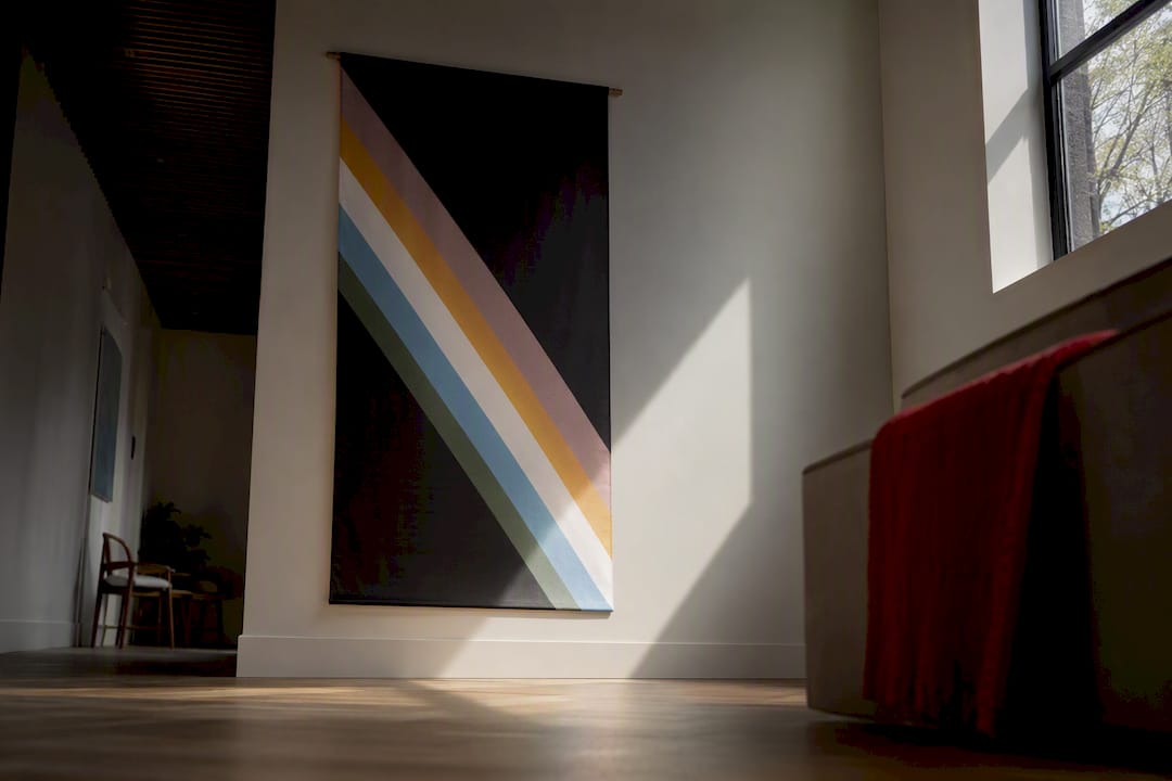
The Disability Pride Flag is a charcoal gray flag crossed by five muted diagonal stripes, redesigned in 2021 by Ann Magill to represent the full range of disability experience. Each stripe stands for a category of disability, from physical to psychiatric to sensory, and the diagonal band symbolizes something specific: light cutting across barriers that have kept disabled people out. The muted colors weren’t a style choice. They were an accessibility decision.
TL;DR:
- The Disability Pride Flag’s muted diagonal stripes are designed for accessibility, reducing flicker and confusion for color-blind viewers.
- Each stripe represents a broad disability category: physical, neurodivergence, invisible disabilities, psychiatric conditions, and sensory impairments.
- The flag evolved from a high-contrast lightning bolt to its current form in 2021, reflecting community input and sensitivity considerations.
- Displaying the flag respectfully involves centering disabled voices, ensuring color contrast, and avoiding tokenism or superficial use.
- The flag is distinct from other disability symbols like the Autistic Pride flag and is meant to foster visibility, acceptance, and ongoing community dialogue.
Table of Contents
- What Does the Disability Pride Flag Look Like?
- What Does Each Stripe Color Represent?
- How Did the Disability Pride Flag Evolve Over Time?
- Are There Other Disability Flags, and Why Is There Debate?
- How Should You Display the Disability Pride Flag Respectfully?
- Why This Flag Resonates With Me
- Wear Your Support the Way the Flag Was Meant To Be Seen
- Sources
- FAQ
What Does the Disability Pride Flag Look Like?
Picture a dark, charcoal gray background with a band of five thin stripes running diagonally from the upper left to the lower right, like a beam of light crossing a dark room. That diagonal placement isn’t decorative. Advocates describe it as light cutting through darkness, a visual echo of disabled people pushing past architectural, social, and institutional obstacles that stood in their way for generations.
The stripe order, from top to bottom, runs red, gold, pale gray or white, blue, and green. Each color sits in a muted, low-saturation tone rather than a bright, saturated one. That’s deliberate. The 2021 redesign pulled the saturation down specifically to reduce flicker and avoid triggering visual sensitivities, a real concern for people with epilepsy, migraine disorders, or sensory processing conditions.
The accessibility thinking goes deeper than color intensity. Designers separated red and green carefully to avoid the confusion common in red-green color blindness, and they arranged luminosity so brightness builds toward the center of the band. That ordering helps the flag stay legible even in low-contrast reproductions, like a black-and-white print or a small embroidered patch.

Pro Tip: If you’re reproducing the flag for a shirt, sticker, or event banner, keep the stripe order and muted tones intact. Brightening the colors for “pop” undermines the exact accessibility feature the design was built around.
What Does Each Stripe Color Represent?
The five stripes on the Disability Pride Flag each cover a distinct category of disability, and together they’re meant to show that disability isn’t one experience but many overlapping ones.
- Red represents physical disabilities, including limited mobility, limb differences, amputation, and chronic pain conditions. Advocates often point to red as the stripe honoring people whose disabilities are the most visible to strangers on the street.
- Gold, a pale yellow, stands for neurodivergence: autism, ADHD, dyslexia, and other learning differences. The term “neurodiversity” gets used deliberately here instead of “disorder,” reflecting a shift in how many advocates frame cognitive difference.
- White covers invisible and undiagnosed disabilities, things like chronic fatigue, autoimmune disease, or conditions still waiting for a diagnosis. This stripe matters because invisible disabilities routinely get questioned or dismissed by people who expect disability to look a certain way.
- Blue represents psychiatric and emotional disabilities, including depression, bipolar disorder, schizophrenia, and PTSD. This stripe carries a particular weight given how much stigma still surrounds mental illness compared to physical conditions.
- Green stands for sensory disabilities: deafness, blindness, and sensory processing disorders. It’s a nod to sensory cultures that have their own rich histories and communities, distinct from other disability experiences.
The stripes aren’t ranked. Their arrangement follows a brightness gradient built for accessibility, not a hierarchy of importance.
How Did the Disability Pride Flag Evolve Over Time?
Ann Magill created the original Disability Pride Flag in 2016, inspired by watching the ADA anniversary pass with almost no public visual symbol the way Pride flags mark LGBTQ+ visibility every June. Magill wanted disabled people to have something equally recognizable.
That first design used a bold lightning bolt across a black field, and it went public in 2019. It didn’t last. Community members with epilepsy and other photosensitive conditions reported that the sharp zigzag pattern and high-contrast bright colors triggered real physical discomfort, sometimes migraines or seizure risk. Magill listened, and the 2021 redesign replaced the jagged bolt with a smooth, straight diagonal band and swapped the vivid palette for the muted tones used today.
That process, revise the design after disabled people say it’s causing harm, reflects a principle central to disability advocacy: nothing about us without us. The flag isn’t a fixed monument. It’s a living symbol, shaped by the exact community it represents, and it changed because people spoke up.

Are There Other Disability Flags, and Why Is There Debate?
Some disagreement follows the flag’s history, mostly rooted in its earlier versions. People who remember the original lightning bolt sometimes still associate the flag with that design, which creates confusion when they see the muted 2021 version and assume it’s a different, unofficial flag entirely. It’s the same flag, evolved.
The Disability Pride Flag also isn’t the only disability-related flag in circulation. The Autistic Pride flag, often shown as a rainbow-colored infinity symbol, represents autism specifically and exists independently, serving a narrower community with its own history and symbolism. The two coexist rather than compete.
One more clarification worth making: there’s no official, fixed list of “13 disabilities” or any set number that the flag enumerates. Disability spans an enormous range of conditions, and the flag’s five stripes represent broad categories, not a finite checklist.
How Should You Display the Disability Pride Flag Respectfully?
The flag shows up at Disability Pride parades, ADA anniversary events, campus accessibility fairs, and awareness campaigns throughout the year. It works as a marker of allyship, remembrance for disabled people lost to systemic neglect, and a visual claim to space that disabled communities have historically been denied.
A few practices keep its use respectful:
- Center disabled voices when you display the flag publicly, rather than using it as a backdrop while excluding disabled people from the actual event or campaign.
- Avoid tokenism. A flag graphic on a single social post during one designated month means little without ongoing commitment.
- Get permission before featuring someone’s personal disability story alongside the flag’s imagery.
- When reproducing the flag, check color contrast so the stripes stay distinguishable, especially for color-blind viewers.
- Add descriptive alt text to any digital image of the flag so screen reader users can access the same information.
- Skip small, low-contrast prints where the muted stripes blur together and lose their meaning entirely.
Why This Flag Resonates With Me
I’ve spent years watching people flinch at the word “schizophrenic” before they’ve heard a single sentence about who I am. That’s what makes a symbol like this one matter: it gives people a way to signal pride out loud, before anyone has to explain themselves. The blue stripe representing psychiatric disability isn’t abstract to me. It’s a color standing in for every conversation I’ve had trying to convince someone that mental illness deserves the same respect as a visible condition.
That’s the same instinct behind putting mental health messages on a T-shirt instead of keeping them private. Wearable advocacy apparel works the same way a flag does: it starts a conversation before anyone has to ask permission to have it. If this flag’s story moved you, our community stories go deeper into what that visibility actually costs and gives back.
— Michelle
Wear Your Support the Way the Flag Was Meant To Be Seen
A flag says a lot standing on its own, but it can’t start a conversation in line at the grocery store or at your desk at work. That’s the gap mental health apparel fills. Schizophrenic.NYC designs shirts, buttons, and accessories around the exact idea the Disability Pride Flag represents: visibility without apology. A Mental Health Awareness Button costs less than lunch and does more to spark a real conversation than most people expect.
These pieces aren’t a substitute for the flag or for community organizing. They’re a companion to it, something you can wear on a Tuesday when there’s no parade happening. Browse the mental health tank tops collection and pick something that says what you’re ready to say out loud.
Sources
- ADA 35: Understanding the Disability Pride Flag
- History of the Disability Pride Flag
- Disability flag — Wikipedia
- The Disability Pride Flag’s Colors and Meaning | GoodHousekeeping
FAQ
What Is the Controversy Surrounding the Disability Pride Flag?
Most confusion traces back to the flag’s earlier versions. The original 2016 to 2019 design used a bold lightning bolt on a black background, which some people still picture when they think of the flag, but the 2021 redesign replaced it with muted diagonal stripes after community members reported the sharper design triggered visual sensitivities.
Is Disability Pride the Same as LGBTQ Pride?
No, they’re separate movements with separate flags, though Disability Pride draws some inspiration from the visibility model LGBTQ+ Pride established. Disability Pride focuses specifically on disability identity, stigma, and access rather than sexual orientation or gender identity.
What Are the 13 Disabilities the Flag Represents?
There’s no official list of 13 disabilities tied to the flag. Disability spans a wide and varied spectrum, and the flag’s five stripes represent broad categories, physical, neurodivergent, invisible, psychiatric, and sensory, rather than a fixed count of conditions.
What Is the Autistic Pride Flag?
The Autistic Pride flag is a separate symbol, typically shown as a rainbow-colored infinity loop, representing autism specifically rather than disability broadly. It coexists with the Disability Pride Flag, and each serves a different community with its own history.
Recommended
- Disabilities in the SPOTLIGHT through advocacy t-shirts
- What Disabled People Are Actually Looking For When Shopping For Clothing
- 10 Advocacy Apparel Ideas That Fund Causes and Keep Wearers Safe