Short verdict: brief exposure to green, whether that’s a few houseplants or a walk through a park, has measurable benefits for mood and stress. A 2022 systematic review found large drops in fatigue and tension alongside real increases in vitality, so a 10 to 20 minute green break is worth building into your day.
TL;DR:
- The 2022 review measured a large fatigue reduction, with an SMD of 0.84, although exposure definitions and study designs varied.
- About one weekly visit or hour in green space delivers roughly half the maximum benefit; four visits or four hours approach the weekly ceiling.
- Green exercise improves well-being and positive affect more than indoor activity, but its effects are stronger for boosting positive feelings than easing negative ones.
- A 10 to 20 minute walk on most days, a desk plant, or a window with a green view can make regular exposure practical.
- Green exposure can ease everyday stress, but it does not treat schizophrenia or replace therapy, medication, or professional care for severe or persistent symptoms.
Table of Contents
- What the strongest research says about green exposure and mood
- Why green tends to feel calming: theories and lab evidence
- How to get the benefits: dose benchmarks and everyday actions
- Using green in interiors, screens, and work areas
- Who benefits most and when green isn’t enough
- Cultural differences and symbolism of green in mental health contexts
- Applying green color psychology in therapeutic environments
- Green color’s role and limits for schizophrenia and specific conditions
- Comparing green with other colors in mental health advocacy and art
- Case studies: green-themed products and mental health awareness
- Publisher perspective: lived-experience advocacy, visible support, and design
- Visible advocacy as a daily companion to wellbeing habits
- FAQ
- Sources
What the strongest research says about green exposure and mood
The clearest evidence comes from a 2022 systematic review and meta-analysis that pooled results across multiple studies on green space exposure. The numbers are striking: fatigue dropped significantly, tension fell markedly, anger decreased notably, and confusion eased. Vitality rose substantially, and heart rate dropped, signaling that the body relaxes along with the mind.
A fatigue reduction of SMD −0.84 counts as a large effect in behavioral research, which means green exposure isn’t a marginal mood tweak. It shows up consistently across the studies this 2022 review analyzed.
A separate 2026 meta-analysis of green exercise adds another layer: physical activity performed in green settings produced significantly greater improvements in wellbeing and positive affect than the same activity done indoors or in built-up areas. The gains were stronger for boosting positive affect than for reducing negative affect, suggesting green exercise is best as a complementary addition to your routine rather than a replacement for other stress-management tools.
The research behind these numbers draws from a mix of study types:
- Randomized controlled trials comparing green and non-green settings for the same activity.
- Observational studies tracking mood and physiological markers during everyday greenspace visits.
- EEG studies measuring brain activity in response to color and natural scenes.
None of this is tidy. Study designs vary widely in how they define “green exposure,” and effects depend heavily on context, which is a limitation the reviews themselves acknowledge. Still, the direction of the evidence is consistent enough to act on.
Why green tends to feel calming: theories and lab evidence
Two frameworks explain most of what researchers observe. Attention Restoration Theory holds that natural environments give our directed attention a rest, letting it recover from the mental fatigue of focused work. Stress Reduction Theory argues that natural scenes trigger a fast, largely automatic drop in physiological arousal, independent of conscious thought. Biophilia, the broader idea that humans have an innate pull toward nature, sits underneath both.
Lab findings back this up in part:
- EEG studies often show cool hues like green and blue increasing alpha wave activity, a pattern linked to relaxed, calm states.
- These effects are context-dependent: the same green tone can read as restful in one room and flat or sterile in another.
- A review of long-term color-emotion research finds green consistently tied to low-arousal positive emotions like relaxation and contentment, a pattern that holds across decades of studies.
Personal history and context still matter. A green that reminds you of a hospital waiting room won’t relax you the way a green that reminds you of a childhood yard will.
How to get the benefits: dose benchmarks and everyday actions
You don’t need a weekend in the woods to feel a difference. Dose-response research on greenspace exposure suggests the relationship follows a curve, not a straight line: a small weekly dose, around one visit or one hour, delivers roughly half of the maximum benefit, while about four visits or four hours a week gets you close to the ceiling. In practice, this means consistency beats intensity.
Here’s how to put that into practice:
- Take a 10 to 20 minute walk somewhere green, even a city block with trees, most days of the week.
- Keep a few potted plants where you work or relax so green is part of your everyday view.
- Step toward a window with a green view during a break instead of scrolling on your phone.
- Wear green or add green accents to your space on days when getting outside isn’t realistic.
- Pair movement with green settings when you can. The 2026 green exercise meta-analysis found this combination outperforms indoor workouts for boosting positive affect.
Pro Tip: Short, frequent green breaks beat one long outing. A daily 15-minute dose builds steadier benefits than a single weekend hike.
If you want to go deeper on this, our piece on why nature is great for your mental health walks through more ways to weave outdoor time into a packed schedule.
Using green in interiors, screens, and work areas
Evidence on colored backgrounds and task performance is mixed. Light, low-saturation greens tend to read as “eye-friendly” for reading and screen time, but results shift depending on the task and who’s doing it, so there’s no single rule that works for everyone.
A few practical starting points by room:
- Bedrooms benefit from muted, restorative greens that support winding down.
- Living rooms do well with moderate green tones that feel comfortable without being flat.
- Focused workspaces often work best with a neutral background and green reserved for accents or short visual breaks.
- A desk plant, a green screensaver for micro-breaks, or a low-saturation accent wall can all nudge a space toward calmer without a full redesign.
Our guide on calming therapy office design covers seating, lighting, and color choices in more depth if you’re setting up a space meant for rest or reflection.
Who benefits most and when green isn’t enough
Color sensitivity isn’t uniform. Some research suggests women show stronger responses to color manipulation in certain tasks, while complex cognitive work tends to blunt color effects altogether, meaning a green wall won’t rescue your focus during a hard problem set the way it might during a casual break.
The dose-response curve also means early gains come fast and later gains slow down. That first weekly hour in a green space does more for you, proportionally, than hour five.
None of this makes green exposure a treatment. It’s a low-cost, accessible support for everyday wellbeing, not a substitute for therapy, medication, or psychiatric care. If symptoms are severe or persistent, the right next step is a licensed mental health professional, not a houseplant.
Cultural differences and symbolism of green in mental health contexts
What green signals shifts depending on where you’re standing. In many Western contexts, green carries associations with nature, renewal, and balance, which lines up with its calming lab results. In other cultural traditions, green carries different weight entirely, tied to luck, fertility, or specific religious meaning rather than relaxation.
This matters for mental health messaging because color symbolism isn’t universal. Green ribbons are widely recognized in mental health awareness campaigns across English-speaking countries, a symbolic use that’s distinct from the psychological research on green exposure itself. One is about shared meaning within a community; the other is about measurable effects on mood and arousal. They can reinforce each other (a green ribbon might prompt someone to actually spend time outside) but they’re not interchangeable claims.
Advocacy work benefits from knowing this distinction. A design choice that reads as calming and hopeful in one audience might carry a different emotional register for another, which is part of why context, not just color, shapes what a green image or product communicates.

Applying green color psychology in therapeutic environments
Clinicians and public health commentators increasingly treat nature-based and green-oriented interventions as a legitimate, low-cost addition to care, not a replacement for it. A commentary on green care interventions describes these approaches as non-stigmatizing psychosocial supports that fit naturally into workplaces and community settings, which is part of why you see more therapy offices leaning on green in their design.
In practice, this shows up as muted green walls in waiting rooms, plants placed where clients sit, and window views prioritized in room layout. None of these choices treat a condition on their own. They lower the ambient stress of the space, which can make the actual clinical work, talk therapy, medication management, group sessions, land a little easier.

The caveat that matters here: color is set dressing for care, not a substitute for it. A calming room makes a session more comfortable. It doesn’t replace the session.
Green color’s role and limits for schizophrenia and specific conditions
There’s no clinical evidence that green exposure changes the course of schizophrenia or treats its symptoms directly. What the research does support is the general stress-reduction and mood benefit of green space, which applies broadly, including to people managing serious mental illness, as one piece of a larger support system.
That distinction is one we think about constantly in our own advocacy work. A calming room or a green break can ease day-to-day stress for someone managing psychosis, but it sits alongside medication adherence, clinical care, and community support, never in place of them. This is also where visible advocacy does work that color psychology alone can’t: reducing the isolation and stigma that often make managing a serious condition harder in the first place.
Comparing green with other colors in mental health advocacy and art
Color choice in mental health advocacy tends to follow established public meaning rather than lab-tested mood effects. Green is widely used for general mental health awareness. Teal and purple show up frequently around specific conditions and causes. Yellow often signals hope or suicide prevention messaging. None of these associations are drawn from the same body of research as the green exposure studies cited above; they’re cultural conventions that built up over years of campaign work.
In art and apparel built for advocacy, the goal isn’t necessarily to calm the viewer the way a green room might. It’s to be seen, to prompt a question, to open a conversation. That’s a different job than the one green does in a therapy office. Bold color and bold graphics are often more effective at sparking dialogue than a muted, restorative palette would be, which is part of why so much mental health merchandise leans toward contrast and statement rather than soft greens.
Both uses of color are legitimate. They’re just solving different problems: one for individual physiological calm, the other for public recognition and stigma reduction.
Case studies: green-themed products and mental health awareness
Green ribbon campaigns remain the most recognizable example of a single color carrying mental health meaning at scale, used across walks, pins, and social campaigns to signal solidarity without requiring anyone to explain their diagnosis out loud.
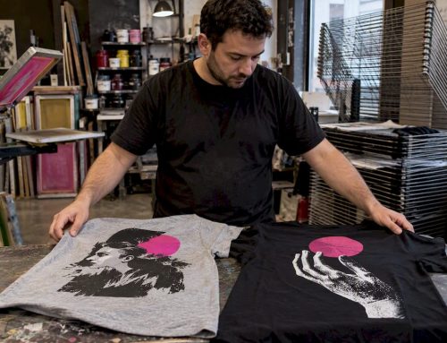
Wearable advocacy works on a related but distinct principle: instead of a universally recognized symbol, bold graphic design sparks a direct conversation. Michelle Hammer, a schizophrenia activist, created an apparel and accessories line that names mental illness outright rather than using a color code to imply it. The approach trades subtlety for directness: a shirt that says what it means tends to prompt a real question from a stranger in a way a quiet green ribbon usually doesn’t.
Both strategies serve people differently. A green ribbon offers a gentle, low-friction way to show support. Direct, graphic messaging invites a harder conversation, which is exactly the gap Schizophrenic.NYC was built to fill for people who want their advocacy to start a dialogue rather than stay quiet.
Publisher perspective: lived-experience advocacy, visible support, and design
We operate around a simple belief: visible reminders change behavior. A shirt, a tote bag, or a piece of art that names mental illness outright does double duty, it normalizes the conversation around us and nudges the wearer toward the same self-care habits we’re talking about here, including stepping outside for a green break. Our guide on practical self-care strategies covers more ground on building these habits day to day.
— Michelle
Visible advocacy as a daily companion to wellbeing habits
Green breaks and houseplants help, but so does feeling less alone in the harder moments. We design apparel, totes, and pillboxes as conversation starters, small, visible reminders that mental illness is worth discussing openly, not substitutes for therapy or medication.
- Browse mental health T-shirts and tank tops built around bold, honest messaging.
- Check out our pillboxes, designed to make medication adherence feel less hidden and more normal.
- Explore Michelle’s original artwork for prints and accessories that turn lived experience into something you can hang on a wall.
If you’re organizing an event or want Michelle to speak on destigmatizing mental illness, visit Schizophrenic to get in touch.
FAQ
What is color psychology?
Color psychology studies how colors influence human emotion, perception, and behavior. In mental health research specifically, it looks at how exposure to certain hues, like green, correlates with measurable changes in mood, stress, and physiological markers such as heart rate.
How to have good mental health?
Good mental health usually comes from a mix of consistent habits: sleep, movement, social connection, and stress management tools like brief nature exposure. For ongoing or severe symptoms, working with a licensed mental health professional is the most reliable path, and small daily habits support that care rather than replace it.
What is the definition of emotional health?
Emotional health refers to your ability to recognize, understand, and manage your emotions in ways that let you function well day to day. It overlaps with mental health but focuses specifically on emotional awareness and regulation rather than broader psychological or cognitive functioning.
Can you give me some examples of mental and emotional health?
Examples include managing stress without it overwhelming your daily routine, maintaining relationships through difficult periods, and recovering from setbacks without prolonged distress. Practical supports like brief green space exposure, which a 2022 meta-analysis linked to reduced tension and fatigue, can play a small supporting role alongside therapy, medication, or community care.
Does spending time around greenery actually improve mood?
Yes. A 2022 systematic review found that green space exposure significantly reduced fatigue, tension, and anger while increasing vitality, with effects large enough to matter in everyday terms. A 2026 meta-analysis found that exercising in green settings significantly improved wellbeing and positive affect compared to indoor workouts.
Sources
- Systematic review and meta-analysis (2022)
- Frontiers systematic review and meta-analysis (2026)
- Review by Mohr & Jonauskaite (PubMed entry)
Recommended
- Choose Silver, Not Purple: Context for Schizophrenia Awareness Color
- 3 Mental Health Ribbon Colors to Remember and When to Wear Them
- 3 Dorm Decor Moves That Boost Mental Health and Sleep, No Wall Damage
- 3 Priorities for a Calming Therapy Office: Seating, Lighting, Color